


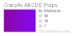
After much frustration over trying out several 'violet' colours the infamous Pantone book had to offer, I decided a standard stock colour wasn't the way to go. After all this label represents the colours of the rainbow, the brilliance shining out from the sun, as if we would go with a standard colour! I was pointed in the direction of a brilliant website, my logo saviour =) The vast array of colours on offer was like a being a little girl in a lolly store, heaven! Check out www.colourlovers.com. I started off liking the first colour story below featuring the violet purple, then I came across the winner!

The violet colours are gorgeous! I'm so inspired... each shade speaks its own story. Just beautiful!
ReplyDeleteGood on you Vanessa. Cant wait to see the final logo.
ReplyDeleteHave a great week
@ Babylise - Yeah the violet colours are amazing! It was so hard choosing one.
ReplyDelete@ Vinh - thanks! I'll be releasing the final logo shortly =) You have a good one as well.